THOUSANDS OF FREE BLOGGER TEMPLATES

Friday, 4 December 2009

Ideas For Title And Font.


Using Adobe Photoshop and the website www.dafont.com, we began to create and play around with different ideas for our title. We experimented with a red, a white and a black canvas to decide which would be more effective in portraying our slasher horror theme.


We also spent a lot of time deciding which font would best describe our killer and his story.


As our trailer is based on a teenage boy who commits a mass kil


ling at his school, we thought it best to use a font which represented youth but also bloodshed and horror. Our final decision was to use a font called INKED GOD which can be found by clicking on the following link:


http://www.dafont.com/inked-god.font
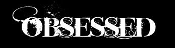


This font was chosen as it looks as if it has been written in a calligraphy pen and also looks as if it has had ink or even blood, splattered around its edges.
-Ideas For Font-

-Influences-

We spent hours deciding on which font would best portray

or message and theme. Our font needed to suggest horror and murder yet also needed to show youth and have a 'teen' feel.


-Halloween II Poster-


We researched the conventions of this Halloween II poster and decided to take ideas from the font that it used. The red suggests death and bloodshed and the grainy cracked font suggest destruction and chaos, themes that correspond with our teaser trailer. However, we still needed a font that portrayed our 'teen' horror theme.

-My Bloody Valentine Poster-
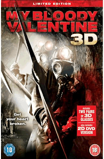

This font was more relevant to our targer audience as My Bloody Valentine is a teen slasher horror. We took inspiration from both fonts in order to create our own original idea.
Thursday, 3 December 2009

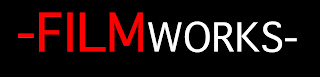
FilmWorks Logo.

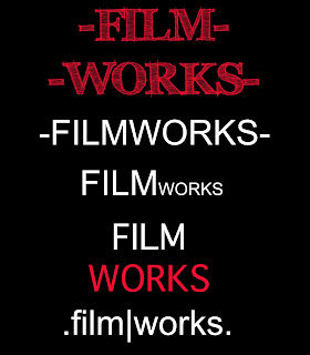
The ideas for our filmworks logo were simple yet sophisticated, as to highlight the companies respected status. In the end we decided on a logo that was simple and aesthetically pleasing for an audience within our target group. The use of the colour red allows audiences to associate this logo with the horror genre.

This is the first image that the audience will see while wa
tching the trailer and so had to be simple, as not to over power the whole teaser, but also eye catching so that audiences will never forget it.

-Final Production Logo-

-RESEARCH-

We researched existing film production logos and developed ours so that it would be original and easily recognisable. A commonality between logos was that they were simple yet bright, nothing was to wordy and all had relevance for the products they were promoting.

-LIONSGATE-

This LIONSGATE logo connotes a production company above all others as the title is placed within the clouds. This also suggests that this company produces movies that are almost heavenly and out of this world.

-COLUMBIA-

This COLUMBIA logo connotes an all American company as the image of a lady is draped in an American flag. She is also carrying a torch and is placed, again within the clouds, which suggests power and authority.

-HAMMER-
This HAMMER logo is for a company based in the United Kingdom which specializes in horror films. HAMMER films were usually low budget, like ours, and promoted British Actors. There are similarities between our logo and this existing one; the color red, the use of bold uppercase font and the black background surrounding it.

The Editing Process.


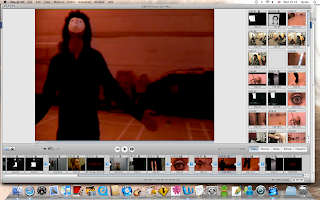
Once we had filmed all of our footage, we transferred it into i-Movie. By using i-Movie we were able to discard of any unwanted footage, and begin the editing process. After our final clips were chosen, they were placed in order and polished to create effect and atmosphere.

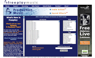
We had to extract all of our audio and replace it with sound effects and a non-copyrighted soundtrack, to create authenticity.

The website we used was http://freeplaymusic.com/


Wednesday, 25 November 2009

Stills.

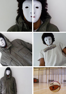
The still images were taken on one of our group memebers Digital Camera. Some of the shots for example the basket ball and the shots of half the killers face, were staged. This alowed us to create a certain mise-en-scene that corresponded with our storyline. The others were taken whilst on location where we were able to gain more realistic shots. The use of both staged and natural shots alowed us to chose from a wide range of stills for our film poster and magazine.


The mask we used on our killer was not too dissimilar from that of Michael Myers' in the Halloween movies. The use of the mask is a convention that has been repeated time and time again in the slasher horror genre. We decided to challenge and develop this convention by putting a modern feel on our mask and protagonist. The killers funky hair and youthful style of dressing gives a contemporary twist on our storyline.

-Michael Myers mask: Halloween-

Monday, 23 November 2009

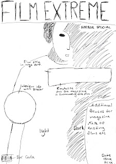
Film Magazine


As part of our marketing and promotion campai
gn, we were asked to create a front cover for a film magazine, promoting our ne
w movie. As a group we decided on which of our still images were most powerful. We chose a mid
close up of our killer, wearing his trademark mask, complying with the convention
s of the slasher movie genre. The image we chose was a still, taken whilst filming our teaser trailer rather than a
n image taken on a photo shoot to add to its authenti
city. We believed that our final image should not only
reflect the theme of the m
agazine, but also the genre of the movie.

-Final Magazine Cover-
-Original Flat Plan-


-First Draft-


-Inspiration-
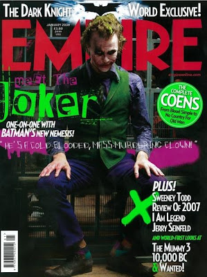
We researched EMPIRE magazine, as inspiration for our own magazine. We liked the use of the bold title and the dominance of the image. Unlike the poster, we wanted to show more of our killer and decided to include most of his body.

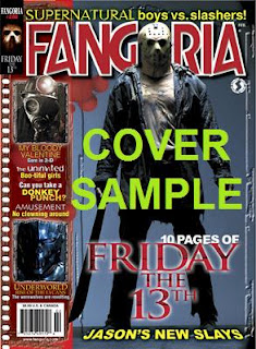
FANGORIA magazine is specially dedicated to the horror genre. Again, the image of Jason dominates the entire page, a convention that was repeated throughout our research. As to stay true to the conventions within horror, we tried our best to make our image dominate our front cover.

Friday, 20 November 2009

Ideas For Film Poster.

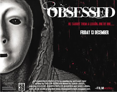
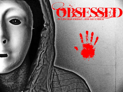
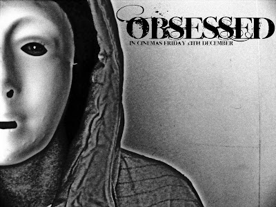
As part of our marketing campaign, we were asked to design a film poster to help advertise and promote our teaser trailer. We decided on an image of half of the killers face in black and white rather than colour, to create a more sinister effect. W
e also decided to use only half of the killers face,
to symbolise and highlight his split personality. The image of our killer has also been stylized using adobe photoshop, to enhance his evil persona.

We decided to play around with the colour of the title using a red font and also a black one. We decided on a white font as our poster was black and red and this allowed the title to really stand out.

We also experimented with the idea of a bloody handprint to suggest the genre of the movie and to also draw in audiences attention.

-Final Poster Idea-


-Research & Ideas-


We studied the conventions of a slasher horror movie poster and found that most images were of the protagonist in desguisse or wearing a mask. This is to introduce the killer to audiences whilst not giving too much away about their character or life. We also found that many posters used similar colours such as black, white and and tended to include a tagline relevant to their genre.

-Halloween II-

We took inspiration from the Halloween II poster and decided to develop some of the conventional horror elements that it displayed. Like this poster, ours only presents part of the protagonists face and head, whilst wearing a scary mask. This helps to create an enigma around the character, drawing in audiences as they ask questions about how and why the character is presented in this way. We also edited our original image of our killer in order to make it black and white. We decided that this simple, stylized portrayal would help the title and tagline to stand out more, whilst not drawing attention away from the blood splattered background.
Our tagline is clear as it is the only text written in red and therefore stands out to any audience. It says "he taught them a lesson one by one." This suggests that although only one killing is shown in the teaser trailer, there are many more to come. This, again creates a sense of mystery for the audience as they are keen to find out who is next.

Thursday, 19 November 2009

Storyboarding.

My job was to create a storyboard to plan our shots for the teaser. This was to ensure that on the day of filming we knew exactly what shots we needed and the locations they needed to be shot in. The storyboard also allowed us to work out what props, sound effects and music we also needed for each shot. Storyboarding was useful as we were able to focus on all aspects of each shots mise-en-scene and what we wanted to include within the frame.