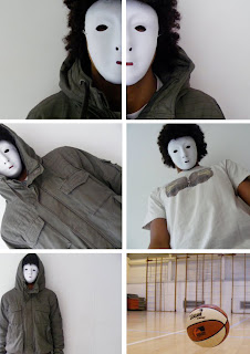
 The still images were taken on one of our group memebers Digital Camera. Some of the shots for example the basket ball and the shots of half the killers face, were staged. This alowed us to create a certain mise-en-scene that corresponded with our storyline. The others were taken whilst on location where we were able to gain more realistic shots. The use of both staged and natural shots alowed us to chose from a wide range of stills for our film poster and magazine.
Wednesday, 25 November 2009
Stills.
 The still images were taken on one of our group memebers Digital Camera. Some of the shots for example the basket ball and the shots of half the killers face, were staged. This alowed us to create a certain mise-en-scene that corresponded with our storyline. The others were taken whilst on location where we were able to gain more realistic shots. The use of both staged and natural shots alowed us to chose from a wide range of stills for our film poster and magazine.
Posted by ObsessedMovie at 02:41 0 comments
Monday, 23 November 2009
Film Magazine
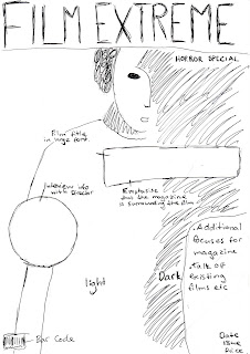
 -Original Flat Plan-

Posted by ObsessedMovie at 02:13 0 comments
Friday, 20 November 2009
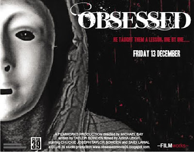
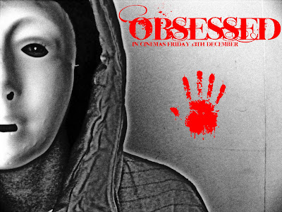
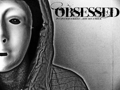
Ideas For Film Poster.

Posted by ObsessedMovie at 02:02 0 comments
Thursday, 19 November 2009
Storyboarding.
My job was to create a storyboard to plan our shots for the teaser. This was to ensure that on the day of filming we knew exactly what shots we needed and the locations they needed to be shot in. The storyboard also allowed us to work out what props, sound effects and music we also needed for each shot. Storyboarding was useful as we were able to focus on all aspects of each shots mise-en-scene and what we wanted to include within the frame.
Posted by ObsessedMovie at 12:32 0 comments
Wednesday, 18 November 2009
Influences.

Posted by ObsessedMovie at 10:35 0 comments
Synopsis.
Posted by ObsessedMovie at 01:26 0 comments
Tuesday, 17 November 2009
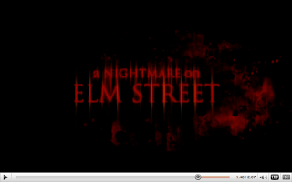
Analysing A Film Trailer.


Posted by ObsessedMovie at 11:40 0 comments
Research.
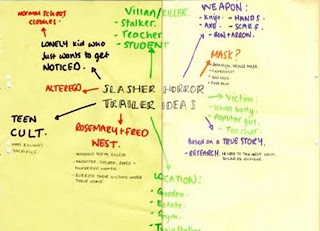
Our original idea was to be based around a true story with influences from the novel We Need To Talk About Kevin, by Lionel Shriver; A story about a boy who became obsessed with the idea of becoming famous. He did so by committing a mass murder at his school. We also decided that we wanted our story to be based locally, and so thoroughly researched the notorious Camden Ripper. Too keep with the conventions on a ‘teen slasher’ we decided that our teaser should be shot in our school, also highlighting our USP and encouraging teens from the local area to get involved with our teaser.
It was decided that we would have a male killer, who always wore a mask and never revealed his true identity, another commonality of the slasher horror genre. We toyed with the idea of using a knife as the murder weapon, however we later decided that we wouldn’t reveal what weapons were used as to create a sense of mystery for our audience.
We came to the decision that this storyline would be both suitable and appealing to an audience over the age of 15 and also for ‘creative and aspiring adults’ keeping true to our brief.
Posted by ObsessedMovie at 02:03 0 comments
Killers In Slasher Horror.
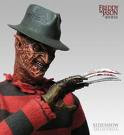 The protagonist, Kruger is dressed in red, symbolising death and blood. He is wearing a black trilby hat, covering one eye. His face is scarred and distorted and he lacks any form of human qualities. His right hand has blades instead of fingers, making him a unique horror figure. His body language suggests that he is ready to pounce of us, his audience and slash us with his sharp fingers.Freddie Kruger: A Nightmare on Elm Street.
 Michael Myers: Halloween.
Myers is dressed in overalls, suggesting his occupation before he became the evil protagonist of this movie. His face is completely covered by a mask made from cloth with several tears and rips in it. This suggests to the audience that there is an enigma and air of mystery surrounding this character. He stands tall with a muscular frame to portray his strength and in his right hand he has a butchers knife.

Chuckie: Childs Play.
Chuckie is clearly a doll dressed in a shirt and overalls. It is apparent that he would have been a common and desirable toy amongst youngsters, before he was possessed. Chuckie’s clothes are b
attered and he has a terrifying expression on his face, portraying his many battles with his victims. Chuckie stands over his latest victim, a young boy and is the more dominant of the two, suggesting a grim end for the boy.

Jason: The Texas Chainsaw Massacre.
Here Jason wears a white plastic mask, as to not reveal his identity. He is dressed in dirty working overalls and appears to have a chain around his neck, referring back to the title of the movie, and Jason’s strength. As an audience and indeed a victim of Jason, we cannot see his eyes and therefore creates more terror and fear.
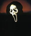
Scream: Scream Movie.
Scream is a hooded and masked figure who represents the grim reaper. As the grim reaper represents death, audiences will be instantly petrified of this character. The mask is used to disorientate his victims, as they cannot see the movement of his eyes nor the expression on his face.

Leslie Vernon: Behind the Mask.
Vernon is dressed in a ripped, off-white shirt with a pair of dungarees. His face is painted however he does not have a mask suggesting his fearlessness. The face paint could also suggest a split personality, where Vernon becomes evil once his face has been painted. Vernon holds a scythe, much like the grim reaper, directing it towards the audience.

Norman Bates: Psycho.
This image is different from the rest as the protagonist doesn’t look scary or wear a mask. Bates is dressed smartly in a shirt and coat. His hair is brushed and his appearance seems neat. This could suggest that he is seen as a normal civilian by his neighbours however, is hiding a dark and evil secret. He looks at the camera menacingly with a smirk suggesting he is psychotic.
Commonalities in Slasher Horror Protagonists.
The images of these protagonists are all similar in some way. Almost all of them wear masks, shielding their faces and suggesting to the audience that they are inhumane and sadistic. Another common feature is the use of a weapon. Most of the characters hold a knife of some kind in their right hand and direct it forcefully toward the camera. Their body language is strong, showing how powerful and in control they are and their costumes represent a struggle or fight.
Posted by ObsessedMovie at 01:48 0 comments
Monday, 16 November 2009
Links.
Posted by ObsessedMovie at 12:23 0 comments


