Using Adobe Photoshop and the website www.dafont.com, we began to create and play around with different ideas for our title. We experimented with a red, a white and a black canvas to decide which would be more effective in portraying our slasher horror theme.
We also spent a lot of time deciding which font would best describe our killer and his story.
As our trailer is based on a teenage boy who commits a mass kil
ling at his school, we thought it best to use a font which represented youth but also bloodshed and horror. Our final decision was to use a font called INKED GOD which can be found by clicking on the following link:
http://www.dafont.com/inked-god.font

This font was chosen as it looks as if it has been written in a calligraphy pen and also looks as if it has had ink or even blood, splattered around its edges.
-Ideas For Font-

-Influences-
We spent hours deciding on which font would best portray
or message and theme. Our font needed to suggest horror and murder yet also needed to show youth and have a 'teen' feel.
-Halloween II Poster-


We researched the conventions of this Halloween II poster and decided to take ideas from the font that it used. The red suggests death and bloodshed and the grainy cracked font suggest destruction and chaos, themes that correspond with our teaser trailer. However, we still needed a font that portrayed our 'teen' horror theme.
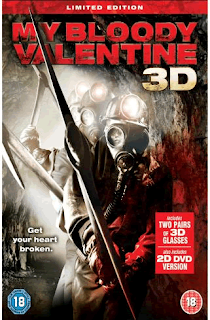
-My Bloody Valentine Poster-

This font was more relevant to our targer audience as My Bloody Valentine is a teen slasher horror. We took inspiration from both fonts in order to create our own original idea.


0 comments:
Post a Comment