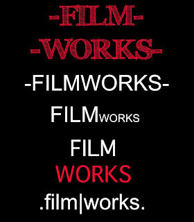
The ideas for our filmworks logo were simple yet sophisticated, as to highlight the companies respected status. In the end we decided on a logo that was simple and aesthetically pleasing for an audience within our target group. The use of the colour red allows audiences to associate this logo with the horror genre.
This is the first image that the audience will see while wa
tching the trailer and so had to be simple, as not to over power the whole teaser, but also eye catching so that audiences will never forget it.
-Final Production Logo-

-RESEARCH-

We researched existing film production logos and developed ours so that it would be original and easily recognisable. A commonality between logos was that they were simple yet bright, nothing was to wordy and all had relevance for the products they were promoting.
-LIONSGATE-

This LIONSGATE logo connotes a production company above all others as the title is placed within the clouds. This also suggests that this company produces movies that are almost heavenly and out of this world.
-COLUMBIA-

This COLUMBIA logo connotes an all American company as the image of a lady is draped in an American flag. She is also carrying a torch and is placed, again within the clouds, which suggests power and authority.
-HAMMER-

This HAMMER logo is for a company based in the United Kingdom which specializes in horror films. HAMMER films were usually low budget, like ours, and promoted British Actors. There are similarities between our logo and this existing one; the color red, the use of bold uppercase font and the black background surrounding it.


0 comments:
Post a Comment