THOUSANDS OF FREE BLOGGER TEMPLATES

Wednesday, 16 December 2009

Welcome.

Welcome to the online blog of the Obsessed Movie! This blog consists of our movie teaser trailer, our poster and magazine front cover promoting our teaser and all of the research and planning surrounding. Any links that do not work on this blog have alternate links located underneath the original. ENJOY!

Friday, 11 December 2009

Evaluation.

In What Ways Does Your Media Product Use, Develop Or Challenge Forms And Conventions Of Real Media Products?

A typical convention of a teaser trailer was that the footage lasted no longer than a minuet and the clips did not give the story away nor were they placed in order.

We used this convention in our own teaser as not to give away too much of the plot, create suspense and mystery but to still give audiences an understanding of the back story. We decided, like many other horror teasers, to only show one death. However, we used a title half way through stating "He thought he would teach them all a lesson" to imply that this was one of many killings.

We did a lot of research around the slasher horror genre and conventional killers within that genre. I analysed 6 killers from various different teasers and theatrical trailers including A Nightmare on Elm Street and Halloween II. All of the protagonists such as Jason and Freddie Kruger followed a strict pattern. All were male and wearing masks. We decided to follow this convention in our own teaser and so gave our killer a 'secret identity' by using a mask. The use of the mask allowed audiences to understand that our killer was an outcast without any humanlike qualities.

After reading through many synopsis' of slasher horror movies it became apparent that the killers were committing these mass murders as some sort of revenge for what had once happened to them. In our synopsis we have expressed that the reason for our killings was because he wanted to be famous, known all around the world. He believed that his victims were too popular for their own good and he wanted to teach them all a lesson, referring back to our tagline on the poster and the still in our teaser.

A convention that we decided to challenge was the idea of a voiceover. Many of the existing teasers and theatrical trailers that we watched included a voiceover. We decided that that by not using a voiceover it would create more suspense and mystery for the audience. We developed this convention by adding in a still title which helped the story to progress.

I also looked into the conventions and typical features of horror movie posters. I found that many of the posters contained an image of their killers, looking their scariest within an establishing shot such as a forest or scary house. We decided to challenge these conventions by styalizing our poster and placing him in a plain black background, with blood running down the wall. The use of the bloodstained wall helped portray our genre and also stuck to conventions. The colours used were also conventional. it became apparent that typical colours used in classic horror movie posters were black and red.

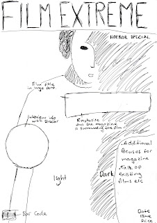
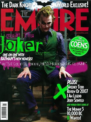
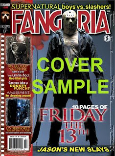
Similarly to the poster, we looked at existing magazine front covers to decide which forms and conventions we needed to include in my own. We took inspiration from existing magazines such as Empire, a well known film magazine, and Fangoria, a magazine dedicated to horror movies. We decided that our magazine would be called Film Extreme as we felt that this would appeal to audiences of all backgrounds and ages. Our research into masterheads was extensive as we wanted to make sure that it was eye catching yet not too overpowering for the reader. We also believed that this would set our magazine apart from the rest because as soon as you see the masterhead, you instantly know that it is dedicated to films and films only. After thorough research it also became apparent that the protagonists on the front cover were always dominant and usually employed a mid shot, and so decided to follow this convention in our own magazine. This gave us enough space around the image to include various subheadings indication what audiences could expect inside the magazine. We chose articles that related to the horror genre and also gave our magazine a subheading indicating that this edition was a ‘slasher horror special’.

We followed these conventions as closely as possible to ensure that our trailer complied with conventions and to fulfil our brief.


Evaluation.

How Did You Use New Media Technologies In The Construction And Research, Planning And Evaluation Stages?


Throughout our entire project many media technologies and applications were used. Both a still digital camera and a video camera were used to shoot the footage, which was later uploaded onto the computer using a FireWire. The film footage was then edited using iMovie where we were able to delete unwanted scenes, cut clips, and add titles, sound effects and a non-copyrighted soundtrack. The soundtrack we used was downloaded from the free website www.freeplaymusic.com along with the heartbeat and typewriter sound effects.

Our production titles were created using Adobe Photoshop, along with the magazine front cover and poster, and then imported onto iMovie. Once we had finished the editing process, our teaser was converted into a Quicktime file and uploaded onto our online blog.

Our still images, taken whilst filming our footage were also edited in Photoshop. They were resized and stylized in order for them to correspond with the teaser. The images were then used to create the film poster, film magazine and blogger template. The font and texts used on the poster and magazine were created using a free website www.dafont.com.

The teaser trailer along with the poster and magazine cover were then uploaded onto our blog where external links and video footage were also used. Our audience feedback video and our directors commentary, alongside the teaser can also be found on http://www.youtube.com/user/ObsessedMovie1as some computers are not compatible with the blogger video footage.

We also decided to use www.facebook.com and www.twitter.com to create an established audience and also to gain important feedback to improve our products. (The links to our facebook and twitter can be found on the Links. page on this blog.)

Pimp My Profile

Evaluation.


How Effective Is The Combination Of Your Main Product And Ancillary Texts?

The marketing campaign we created was successful as we have used a number of promotional tools that can easily be accessed nationally and globally by our specific, teen target audience. The teaser trailer was posted on youtube and facebook and audiences were able to follow our progress using twitter. All of these social networking sites are both easily accessible and used by millions of ‘computer savvy’ teens across the globe. Our objective for the teaser trailer was to create word of mouth. The limited footage allows audiences to recognize the slasher horror genre without giving too much of the back story away. This created hype around the teaser, causing audiences to discuss its content and encouraging them to find out more information online, using facebook, twitter and youtube. This made it easier for us to gain an established audience so that when the poster and magazine was published they were more confident to give both positive and negative feedback.


Pimp My Profile

Thursday, 10 December 2009

Final Teaser Edit.


After gaining valuable audience feedback and criticisms we edited our trailer one last time in order to make it as realistic and true to the brief as possible. We added a soundtrack that would suggest both the slasher horror genre and also a teenage feel and also added in the title stating ‘he wanted to teach them all a lesson’ as it corresponds with our poster and also suggests that a mass murder will take place. I believe that the trailer is now more effective in teasing the audience and fully answers the brief.

Trailer Commentary.


This is an edit of our final teaser but without any sound effects or music track. The idea of this commentary is to explain each shot, why we used it and what effect we intended to have on our audience.

Wednesday, 9 December 2009

Audience Feedback.


To gain important audience feedback we created a facebook account. The account included pictures from the filming, production work as well as the actual movie trailer. Audiences were able to become fans of the movie and were also encouraged to leave comments, both positive and negative. From the comments we received, we were able to make changes and improve our teaser trailer in order to make it more appealing to our target audience.

-Screen grab from our facebook page-

Our facebook can be found by clicking on this link

From our feedback there were some comments that frequently came up:
- Our USP was obvious - Acland Burghley school location (gym), mention of Camden Ripper.
- It was clear that the teaser was made for teens.
- Held back enough information to keep audience in suspense.
- Well filmed and edited.
- Good at concealing killers identity.
- Music was both scary and 'teen-like'

However, our facebook could only gather a limited amount of feedback, so we decided to set up mini interviews with people ranging from the ages of 15 onwards and filmed their response.


From our audience feedback it soon became apparent that we had created a both successful and scary teen slasher horror teaser that attracts our target audience. Many of our interviewees said that our teaser was excellent and that they would defiantly pay to see the whole movie in a cinema or on dvd.

Friday, 4 December 2009

Ideas For Title And Font.


Using Adobe Photoshop and the website www.dafont.com, we began to create and play around with different ideas for our title. We experimented with a red, a white and a black canvas to decide which would be more effective in portraying our slasher horror theme.


We also spent a lot of time deciding which font would best describe our killer and his story.


As our trailer is based on a teenage boy who commits a mass kil


ling at his school, we thought it best to use a font which represented youth but also bloodshed and horror. Our final decision was to use a font called INKED GOD which can be found by clicking on the following link:


http://www.dafont.com/inked-god.font


This font was chosen as it looks as if it has been written in a calligraphy pen and also looks as if it has had ink or even blood, splattered around its edges.
-Ideas For Font-

-Influences-

We spent hours deciding on which font would best portray

or message and theme. Our font needed to suggest horror and murder yet also needed to show youth and have a 'teen' feel.


-Halloween II Poster-


We researched the conventions of this Halloween II poster and decided to take ideas from the font that it used. The red suggests death and bloodshed and the grainy cracked font suggest destruction and chaos, themes that correspond with our teaser trailer. However, we still needed a font that portrayed our 'teen' horror theme.

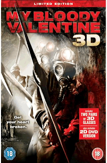
-My Bloody Valentine Poster-


This font was more relevant to our targer audience as My Bloody Valentine is a teen slasher horror. We took inspiration from both fonts in order to create our own original idea.

Thursday, 3 December 2009

FilmWorks Logo.

The ideas for our filmworks logo were simple yet sophisticated, as to highlight the companies respected status. In the end we decided on a logo that was simple and aesthetically pleasing for an audience within our target group. The use of the colour red allows audiences to associate this logo with the horror genre.

This is the first image that the audience will see while wa
tching the trailer and so had to be simple, as not to over power the whole teaser, but also eye catching so that audiences will never forget it.

-Final Production Logo-

-RESEARCH-

We researched existing film production logos and developed ours so that it would be original and easily recognisable. A commonality between logos was that they were simple yet bright, nothing was to wordy and all had relevance for the products they were promoting.

-LIONSGATE-

This LIONSGATE logo connotes a production company above all others as the title is placed within the clouds. This also suggests that this company produces movies that are almost heavenly and out of this world.

-COLUMBIA-

This COLUMBIA logo connotes an all American company as the image of a lady is draped in an American flag. She is also carrying a torch and is placed, again within the clouds, which suggests power and authority.

-HAMMER-
This HAMMER logo is for a company based in the United Kingdom which specializes in horror films. HAMMER films were usually low budget, like ours, and promoted British Actors. There are similarities between our logo and this existing one; the color red, the use of bold uppercase font and the black background surrounding it.

The Editing Process.


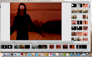
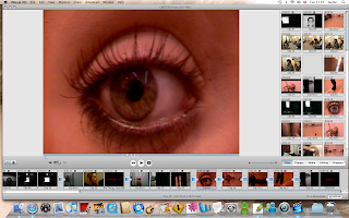
Once we had filmed all of our footage, we transferred it into i-Movie. By using i-Movie we were able to discard of any unwanted footage, and begin the editing process. After our final clips were chosen, they were placed in order and polished to create effect and atmosphere.

We had to extract all of our audio and replace it with sound effects and a non-copyrighted soundtrack, to create authenticity.

The website we used was http://freeplaymusic.com/


Wednesday, 25 November 2009

Stills.

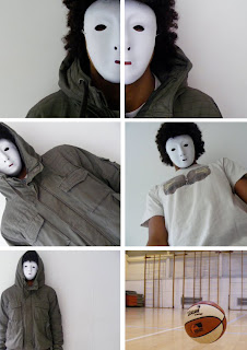
The still images were taken on one of our group memebers Digital Camera. Some of the shots for example the basket ball and the shots of half the killers face, were staged. This alowed us to create a certain mise-en-scene that corresponded with our storyline. The others were taken whilst on location where we were able to gain more realistic shots. The use of both staged and natural shots alowed us to chose from a wide range of stills for our film poster and magazine.


The mask we used on our killer was not too dissimilar from that of Michael Myers' in the Halloween movies. The use of the mask is a convention that has been repeated time and time again in the slasher horror genre. We decided to challenge and develop this convention by putting a modern feel on our mask and protagonist. The killers funky hair and youthful style of dressing gives a contemporary twist on our storyline.

-Michael Myers mask: Halloween-

Monday, 23 November 2009

Film Magazine


As part of our marketing and promotion campai
gn, we were asked to create a front cover for a film magazine, promoting our ne
w movie. As a group we decided on which of our still images were most powerful. We chose a mid
close up of our killer, wearing his trademark mask, complying with the convention
s of the slasher movie genre. The image we chose was a still, taken whilst filming our teaser trailer rather than a
n image taken on a photo shoot to add to its authenti
city. We believed that our final image should not only
reflect the theme of the m
agazine, but also the genre of the movie.

-Final Magazine Cover-
-Original Flat Plan-


-First Draft-


-Inspiration-
We researched EMPIRE magazine, as inspiration for our own magazine. We liked the use of the bold title and the dominance of the image. Unlike the poster, we wanted to show more of our killer and decided to include most of his body.

FANGORIA magazine is specially dedicated to the horror genre. Again, the image of Jason dominates the entire page, a convention that was repeated throughout our research. As to stay true to the conventions within horror, we tried our best to make our image dominate our front cover.

Friday, 20 November 2009

Ideas For Film Poster.
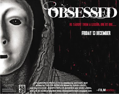
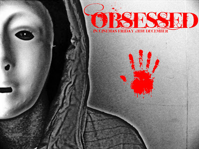
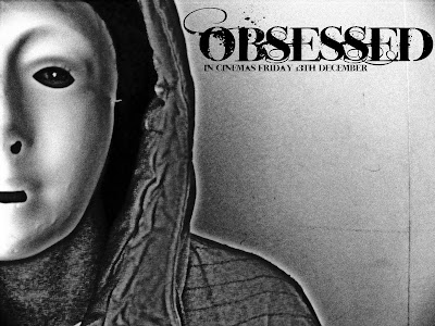
As part of our marketing campaign, we were asked to design a film poster to help advertise and promote our teaser trailer. We decided on an image of half of the killers face in black and white rather than colour, to create a more sinister effect. W
e also decided to use only half of the killers face,
to symbolise and highlight his split personality. The image of our killer has also been stylized using adobe photoshop, to enhance his evil persona.

We decided to play around with the colour of the title using a red font and also a black one. We decided on a white font as our poster was black and red and this allowed the title to really stand out.

We also experimented with the idea of a bloody handprint to suggest the genre of the movie and to also draw in audiences attention.

-Final Poster Idea-


-Research & Ideas-


We studied the conventions of a slasher horror movie poster and found that most images were of the protagonist in desguisse or wearing a mask. This is to introduce the killer to audiences whilst not giving too much away about their character or life. We also found that many posters used similar colours such as black, white and and tended to include a tagline relevant to their genre.

-Halloween II-

We took inspiration from the Halloween II poster and decided to develop some of the conventional horror elements that it displayed. Like this poster, ours only presents part of the protagonists face and head, whilst wearing a scary mask. This helps to create an enigma around the character, drawing in audiences as they ask questions about how and why the character is presented in this way. We also edited our original image of our killer in order to make it black and white. We decided that this simple, stylized portrayal would help the title and tagline to stand out more, whilst not drawing attention away from the blood splattered background.
Our tagline is clear as it is the only text written in red and therefore stands out to any audience. It says "he taught them a lesson one by one." This suggests that although only one killing is shown in the teaser trailer, there are many more to come. This, again creates a sense of mystery for the audience as they are keen to find out who is next.

Thursday, 19 November 2009

Storyboarding.

My job was to create a storyboard to plan our shots for the teaser. This was to ensure that on the day of filming we knew exactly what shots we needed and the locations they needed to be shot in. The storyboard also allowed us to work out what props, sound effects and music we also needed for each shot. Storyboarding was useful as we were able to focus on all aspects of each shots mise-en-scene and what we wanted to include within the frame.

Wednesday, 18 November 2009

Influences.

We took influence from the book We Need To Talk About Kevin by Lionel Shriver. A book about a fictional school massacre.


We also thought about our target audience and took influences from the stories of local serial killers like Anthony Hardy.


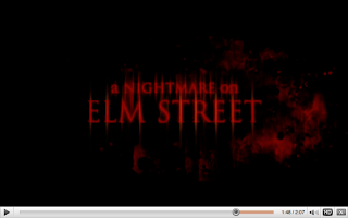
-Screen grab from A Nightmare On Elm Street trailer-

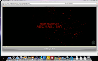
This still image taken from the A Nightmare On Elm Street movie trailer influenced our own trailer and our poster. The blood splattered background can be seen in our movie poster and our trailer also ends with our production details listed similarly to this shot.

-Screen grab from A Nightmare On Elm Street trailer-
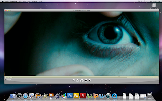
This still image taken from the A Nightmare On Elm Street trailer gave us an idea for our own teaser trailer. There is a shot in our teaser that is an extreme close up of a female victims eye with her looking frantically around. The shot of the eye suggests terror and fear and was largely influenced by this shot as shown below.


Synopsis.


Our film is based on a young boy, Adam, who has always had difficulty fitting in with children his own age. He is fifteen and has never really had any friends. He spends most of his time at home on his computer and is fascinated by famous killers such as the Camden Ripper and the West's.
Adam longs to be noticed, but for all the wrong reasons. He wants his name to be known across the world and he believes the only way of doing so is by committing a mass killing at his school. Adam watches his victims over a number of days, analyzing their every move and planning his attack. he is careful and secretive as he does not want his plan to be unveiled before the killings take place. He invites his selected victim to an 'Award Ceremony' in the gym of his school where he plans to carry out the attack.
First to arrive is Sarah, a pretty and popular girl from his year group, who has dressed up for the occasion. As the enters the room the lights go off revealing Adam who emerges from the shadows. He repeatedly beats and tortures her with a basketball before hanging her from a gym rope. We are left with an image of a basketball bouncing across the gym, covered in blood.
Adam's other victims are found dead one by one across his school. They take place in the space of a week, and still Adam hasn't been found out. It isn't until his last victim is dead that he waits for the school to open the next day and is inevitably caught. He falls asleep next to his victim, covered in blood. When they discover him the next day, he seems pleased to be caught and is finally happy, now that everybody knows his name.

Tuesday, 17 November 2009

Analysing A Film Trailer.

As the trailer begins, the first thing we see is the production logo: NEW LINE CINEMA, a Time Warner Company. From the production logo alone, the audience can assume that this trailer will be of the highest standard as Time Warner is an extremely prestigious film company. Whilst creating our own production logo we to
ok these elements into consideration and pr
oduced our log
o so that it would appear sophisticated and trustworthy to our audience. We also used the convention of having our trailer opening with an image of our production logo.
The establishing shot sets the scene for the trailer. It depicts a deserted wasteland, employing a midshot of the side of a building. This shot is not too dissimilar from our establishing shot, except ours is in black and white.

-Establishing shot from Nightmare on El
m Street-

-Establishing shot from our teaser Obsessed-

The trailer then shows a rapid succession of location shots with a middle aged man running through the deserted streets. An angry mob are following him and soon set a house on fire with him inside it. The audience do not know why they are chasing him or why they wish to kill him, creating a sense of mystery for the audience, a typical conv
ention of the slasher horror genre. Unlike our teaser, this trailer shows more than one victim and how and when they are murdered. We decided to challenge this convention as we felt that holding back that information from the audience would make them want to find out more. The eerie and childlike music and the use of 'evil children' suggest that the killer is seeking revenge from something that happened to him as a child. We decided to include eerie, cho
ir music to our teaser to connote mystery and also revenge. The
speed of the trailer, like most is rapid and only shows the killer from behind. However we are introduced to his murder weapon; his razor sharp claws.
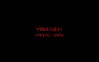
The trailer ends with a close up of a woman screaming then cuts to the titles, which our covered in blood. We took inspiration from the font and layout of this shot, for our own closing clip.

-A Nightmare On Elm Street-

-Obsessed Movie-


The trailer ends on a shot of Kruger stroking his latest victims face with his claws. He whispers "don't worry about it. This wont hurt one little bit." This is an extremely dramatic ending and leaves the audience desperately wanting to find out more about the movie.


Research.

-Brainstorm-

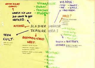
We began by creating an idea and concept for our slasher horror trailer, in the form of a brainstorm. We wrote down our initial ideas on what we wanted to include based on the research we had been doing in class. For example, we had to take into consideration the conventions of slasher horror and how we would conform to them, challenge them or develop them.
Our original idea was to be based around a true story with influences from the novel We Need To Talk About Kevin, by Lionel Shriver; A story about a boy who became obsessed with the idea of becoming famous. He did so by committing a mass murder at his school. We also decided that we wanted our story to be based locally, and so thoroughly researched the notorious Camden Ripper. Too keep with the conventions on a ‘teen slasher’ we decided that our teaser should be shot in our school, also highlighting our USP and encouraging teens from the local area to get involved with our teaser.
It was decided that we would have a male killer, who always wore a mask and never revealed his true identity, another commonality of the slasher horror genre. We toyed with the idea of using a knife as the murder weapon, however we later decided that we wouldn’t reveal what weapons were used as to create a sense of mystery for our audience.
We came to the decision that this storyline would be both suitable and appealing to an audience over the age of 15 and also for ‘creative and aspiring adults’ keeping true to our brief.